Inclusive UX Concept Addressing Gaps from Threads’ Initial Launch
YEAR
2023
SERVICES
Web Development
CLIENT
Myself
Closing Accessibility Gaps Left by Threads’ Initial Launch
The Problem
When Threads first launched, it delivered a clean, modern social experience—but early usability patterns also revealed gaps that can disproportionately affect users with accessibility needs. The problem wasn’t that the interface was unusable; it was that certain design defaults (contrast choices, layout rigidity, and navigation patterns) could make everyday messaging harder for people with visual or motor impairments, or for users who rely on alternative viewing orientations.
Many mainstream messaging and social apps optimize for the “average” user and the most common device posture: portrait mode, high visual density, and gesture-heavy navigation. For users who need clearer hierarchy, stronger contrast, or more comfortable viewing in landscape mode, these choices create friction. Even small barriers—unclear icon states, low-contrast UI elements, or inconsistent navigation—compound into fatigue and reduced engagement over time.
Chirpy was created as a redesign concept that responds to those early gaps by asking a different question: what would a Threads-like experience look like if accessibility and clarity were treated as first-class product requirements from the start?
The core problem was to redesign a familiar, modern messaging experience in a way that preserves speed and simplicity while making communication more inclusive—especially for individuals with impairments who need better visibility, more flexible orientation options, and more intuitive navigation.
Building an Accessibility-First Messaging Experience Inspired by Threads
What I did
Chirpy is a redesign concept and messaging platform approach that focuses on making everyday communication easier to see, easier to navigate, and easier to use across different device orientations. I approached this project as both a UX problem and a product strategy exercise: identify where Threads’ early experience could exclude users, then redesign key interaction patterns to reduce friction without adding complexity.
Key actions I took included:
Analyzed common accessibility gaps in early Threads-style UI patterns (contrast, hierarchy, and navigation clarity)
Improved color contrast and readability to support users with low vision and reduce strain during longer sessions
Designed landscape mode support to accommodate different viewing needs and device usage contexts
Refined information hierarchy (spacing, typography, and component emphasis) to make scanning and decision-making faster
Created more intuitive navigation patterns and clearer UI states to reduce confusion and mis-taps
Kept the experience lightweight and familiar so users can transition from a Threads-like mental model without re-learning the interface
Throughout the redesign, I prioritized inclusive usability: the interface needed to be visually clear, consistent, and predictable. The goal was not to “over-design” accessibility, but to integrate it into the default experience so that users with impairments gain meaningful improvements without sacrificing the simplicity that makes messaging apps feel fast.
A More Inclusive Threads-Like Experience With Better Usability
The Results
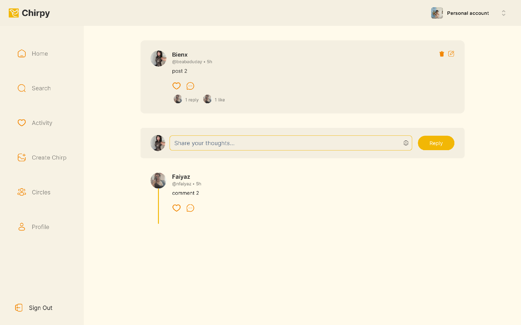
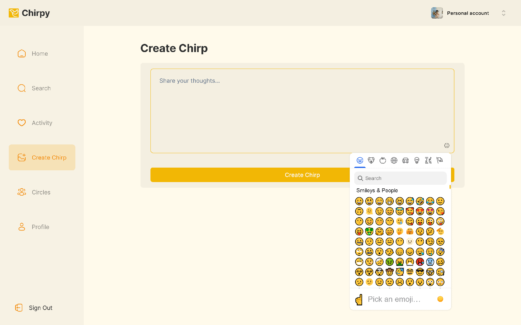
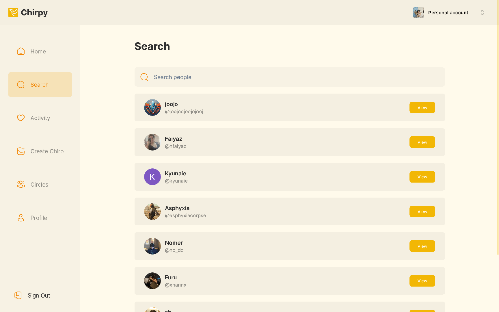
Chirpy resulted in a more accessible, Threads-inspired messaging experience that improves clarity and comfort for a wider range of users. By strengthening contrast and readability, the redesign supports users who struggle with low-visibility UI elements and helps reduce eye strain in day-to-day communication.
Landscape mode support expands real-world usability by accommodating users who prefer (or require) horizontal viewing—whether due to device mounting setups, accessibility tools, or comfort during longer interactions. This flexibility makes the experience feel less restrictive and more inclusive without changing the core purpose of the app.
Navigation and interface clarity were also improved through more intuitive patterns and clearer states, helping users understand where they are in the app and what actions are available at any time. This reduces hesitation, mis-taps, and the cognitive load that can come from ambiguous icons or overly condensed layouts.
Overall, Chirpy demonstrates how accessibility-first decisions can enhance the user experience for everyone—not only users with impairments—by making a modern messaging interface cleaner, more flexible, and easier to use from the very first interaction.